
The design of a book’s cover has long been an essential factor in persuading people to take up a book. Today’s readers shop for both physical and digital books on the internet. The importance of book cover design has never been greater.
Readers are presented with a plethora of alternatives and offers. A decent cover may be the difference between a reader pausing to read your description or quickly moving on to the next page. One of the first stages in persuading someone to read your book is to grab their attention with your cover.
Consider your book cover to be advertising. It’ll be the most extensively utilized advertisement creative you’ll ever have. It’s also crucial to invest in.
With over a million self-published books released each year, it’s important that your book stands out on the inside and out, in print and eBook.
Sure, it’s not as exciting as writing, but it’s important to bring your work to the point where it belongs: in front of your audience. Failure to evaluate the reader’s experience on any of these (or other) factors can lead to lost sales and a poor book launch.
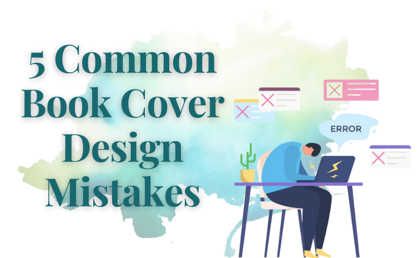
We’ll Go Over the Five Most Common Book Cover Design Mistakes in this Blog.
1. Excessive Elements on the Cover
This is a typical mistake, especially among inexperienced designers. It’s natural to feel compelled to include several parts of your narrative on the cover in order to make it more detailed. Covers featuring all of the key characters featured are also frequent to give readers a better sense as to how they look.
The following are the major drawbacks of stuffing a cover with narrative elements:
- It’s confusing; the reader won’t know which element is the most significant.
- On most retail sites, such as Amazon, book covers are shown as rows of tiny thumbnail pictures. There is just not enough room on that little thumbnail to convey much information.
- As a general rule, one attractive element that communicates a portion of the tale is nearly always preferable than a large number of tiny ones.
The urge to have a book’s cover describe it comes from a genuine concern for the reader. Unfortunately, people will likely enjoy such book covers only after they have read the text. A mixture of materials out of context might be overpowering and turn a reader off.
Many book cover designers may ask you to fill out a form with information on what you, the author, want on the cover; be careful to tell them you don’t want too many things on the cover.
2. Genre Fit
The manner book covers are designed has evolved into distinct differences between genres. If your book cover lacks certain stylistic characteristics, people interested in that genre will pass it over since it does not resemble previous books they have loved.
Remember that your cover has only a fraction of a second to create an impact. The majority of readers are familiar with their preferred genres and their associated covers. If your cover does not match your genre, you risk alienating people who might enjoy your work. Or, you may get readers who were expecting something else based on your cover.
3. Poor Font Choice
It’s all about conveying to readers what your book has to offer yet again. The font on your cover should be comparable to that on other covers in your category.
When picking a font, check through bestsellers in your category. You don’t have to use the same font as everyone else, but something close enough that readers won’t be confused. In general, a good cover designer will choose acceptable fonts, but don’t ask for a specific font if it’s not in your genre.
4. Bad Image Quality
If you’re new to book cover design, this is a simple error to make, and it’s vital to be aware of it in case you work with an inexperienced designer.
If you’re using a picture for a cover, be cautious if you need to expand it at any time. As little pictures are stretched to fill space, their quality degrades.
Also, if you wish to modify the size of an image, be cautious. If your background image is considerably larger than Amazon’s suggested cover dimensions (2,560 by 1,600 pixels) and your cover image is much smaller (2,560 by 2,600 pixels), you should crop the image to remove the additional width.
Some programs enable you to just drag the image smaller, resulting in a compressed version of the original.
5. Poor Readability
Vendors now show book covers in a variety of sizes and formats. Readers will almost usually view your cover at a much smaller scale than a physical book cover.
This implies that it’s critical that your cover be readable when it’s scaled-down and placed in a book list.
When browsing through a list of books, readers will be lured to a cover that they can readily comprehend. Looking at your book cover as a thumbnail is a useful technique. When a designer delivers you a book cover, you usually look at it on your computer in big format.
Reduce it to thumbnail size to ensure that it will appear nice on retail sites.
Conclusion
The design of a book’s cover is crucial to its success, and there’s a lot more to consider than you would think. A professionally designed book cover’s value and quality cannot be emphasized more.
If you are self-publishing or designing your book by yourself then it might result in something unprofessional, especially if you are new to it. Professional book cover designers will turn your cover into a very attractive one.
Hiring a professional designer with a strong portfolio and a solid reputation will help you avoid these self-publishing mistakes and take your book to the next level. It might assist you in ensuring that all of your hard work on your book yields the desired outcomes.
-Isabell S.